Color
Color is a tool used to express style, evoke emotion, and communicate meaning. A standardized color palette and its intentional application ensure a familiar, comfortable, and consistent experience.

Fluent palettes
Fluent defines three color palettes: neutral, shared, and brand. Each palette performs specific functions. Read each section to learn about the specific roles of each one and how to apply them across products.
Neutral colors
The neutral palette consists of the black, white, and grays that ground an interface. These colors are used on surfaces, text, and layout elements. When used in components, they often connote a change in state.

Visual hierarchy using neutrals
Use lighter neutrals on surfaces to highlight areas of primary focus and create a sense of hierarchy. This ensures a person’s eye is drawn to the areas of an interface that need the most attention or that will be most useful to them.

Shared colors
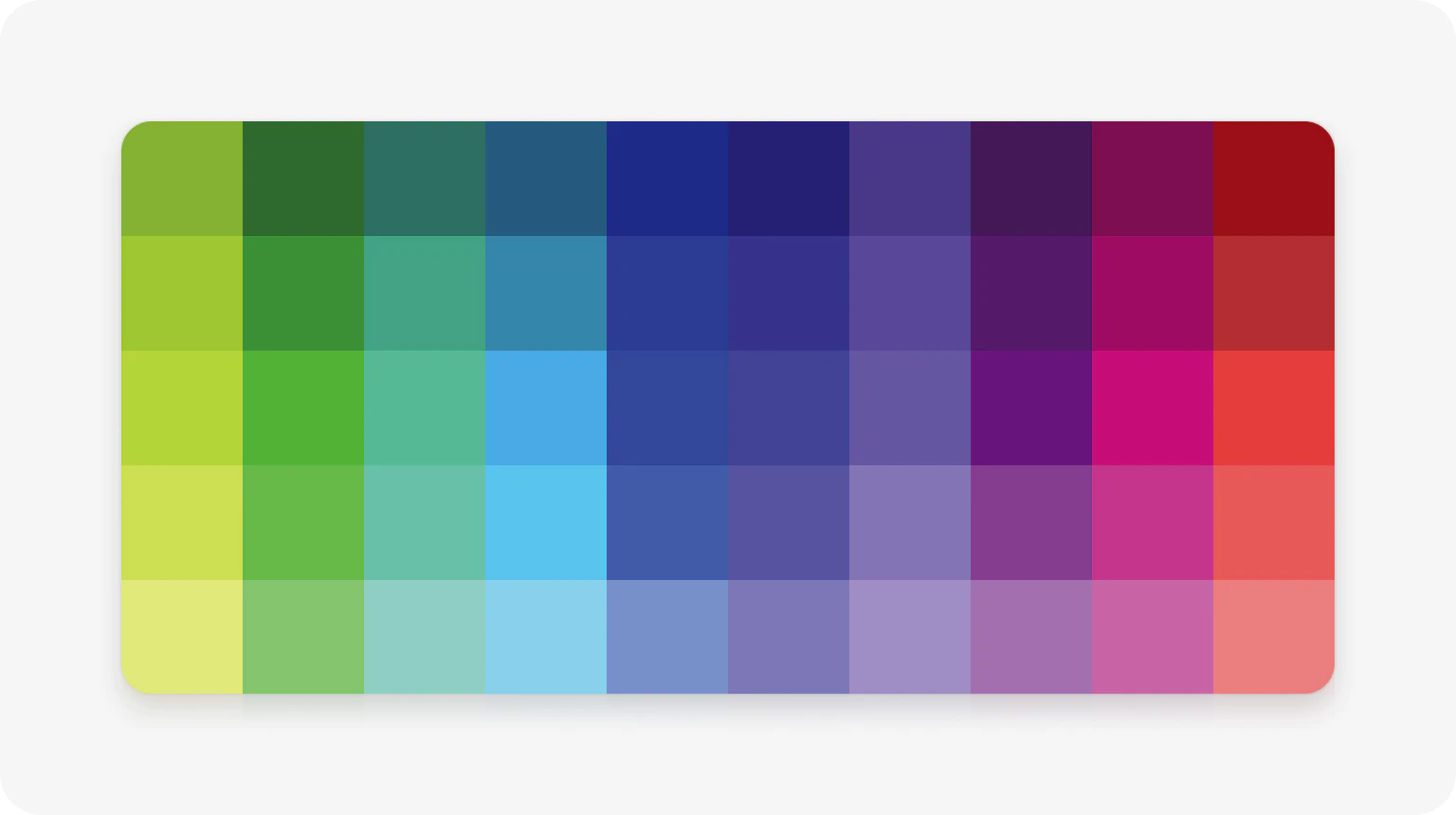
Shared colors are aligned across the M365 suite of apps and are used in Fluent high-value, reusable components like avatars, calendars, and badges. Shared colors allow for quick mental recognition of components and functions across products.
Use shared colors sparingly to accent and highlight important areas of an interface.
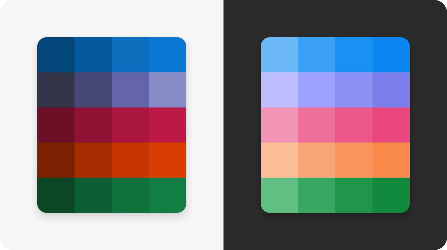
In dark mode, the colors of the shared palette shift in saturation and brightness to reduce eye strain and accommodate visual accessibility needs.
Semantic Colors
Select colors in the shared palette are specifically used to communicate feedback, status, or urgency. These are known as semantic colors and they should always convey important information.

Use semantic colors for important messages
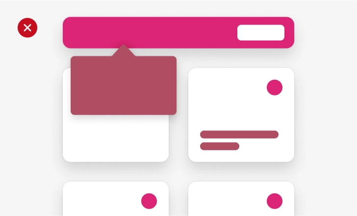
Don’t use them for decoration
Semantic colors communicate at-a-glance information by building on real world associations, like red for danger, yellow for caution, and green for positive feedback. Using them consistently and pairing them with other indicators help reinforce these contexts and decrease cognitive load.

Brand colors
Color is key to the immediate brand recognition of our suite of products. The products in M365 are distinguishable by their dedicated brand colors.
| Product colors - light mode | |
|---|---|
| Communication Blue & Outlook | PowerBI |
| Office | PowerPoint |
| Windows | Publisher |
| Cortana | Stream |
| Excel | Sway |
| GroupMe | Teams |
| OneDrive | Visio |
| Planner & Project | Word |
| Power Apps | Booking |
Apply brand colors to different areas of an interface not only to create visual prominence, but also to anchor people in a specific product experience. Avoid overusing brand colors or using them on large surfaces as they can dilute a hierarchy and make an experience difficult to navigate.
Buttons and CTAs
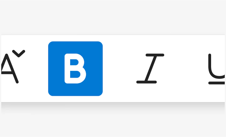
Selected states
Interaction States
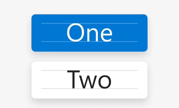
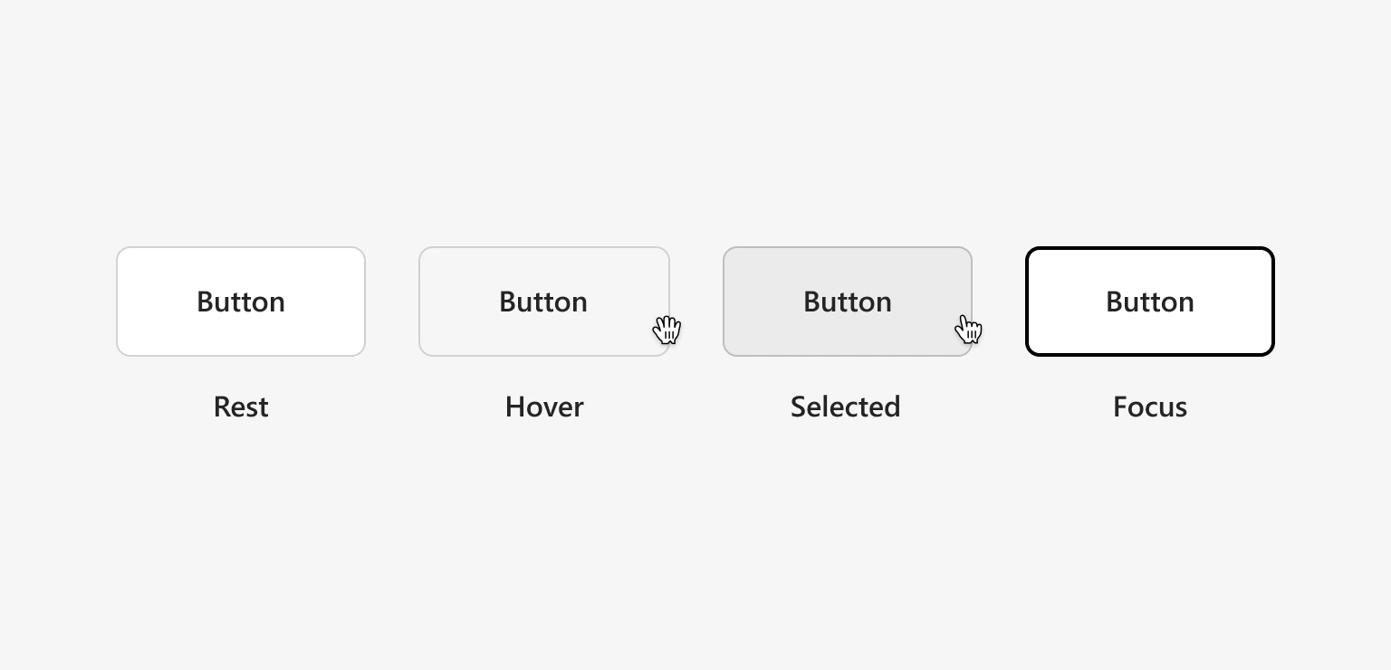
The Fluent palettes are often used to indicate interaction states on components. Generally, a component will get darker as someone interacts with it, from the lightest rest state, to a darker hover, all the way to the darkest selected state.
For focus states, the color of the control does not change, but the container gets a thicker stroke to create clear visual distinctions between mouse and keyboard interactions.
Platform distinction
Windows interaction states currently treat color in reverse; controls will get lighter as a person interacts with them.
Accessibility best practices
Keep accessibility top of mind when building Fluent experiences with color.
- Ensure contrast that’s perceivable to people with low-visibility or color-blindness
- When possible, let people personalize their color scheme so that it always works for them
Don’t use color as the only way to communicate. Accompany it with text, graphics, and other indicators to convey information in many ways.
These are just some ways you can commit to one of Fluent’s core tenets: one for all, all for one. See the accessibility guidelines for more.
Color tokens
Consistent color usage creates visual continuity throughout experiences and even across products. The easiest way to guarantee uniform color usage is to use Fluent’s design token system. Each value in the Fluent palettes is stored as a context-agnostic global token. Alias tokens then provide the context that makes it easy to choose the right color without having to hunt down hex codes.
See our token guidance to learn more about improving the design to development workflow with tokens.