Accordion Preview
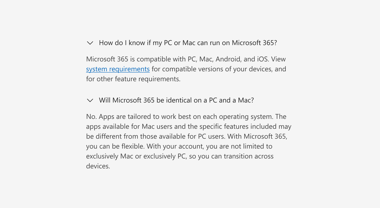
An accordion groups sections of related content that can be opened and closed.
Accordions decrease cognitive load by letting people choose which sections of content they see, like questions in an FAQ. Never put information that's required for the current task inside an accordion. Consider a treatment that gives it more prominence.
Resources
Behavior
Closed by default
By default, accordions items are closed. If it’s helpful to give information prominence and have it be seen automatically, specify which accordion items should be open by default.

Multiple open items
Accordion items automatically close when another is opened. Sometimes, people may prefer to have multiple items open at once. Allow this in scenarios where multiple open items won’t be overwhelming. Never put information in one accordion item that needs to be referenced in another accordion item.

Layout
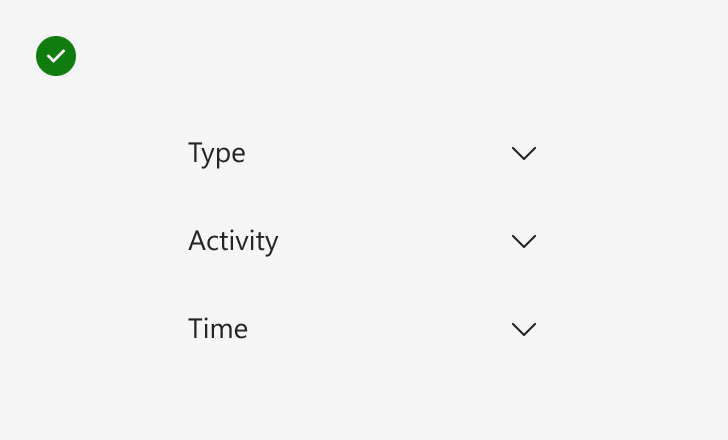
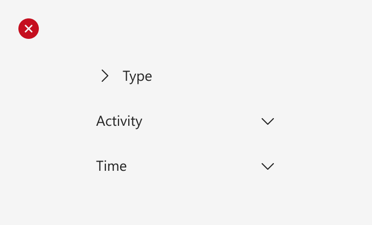
The chevron icon signifies additional content and indicates an accordion item’s interaction. The chevron can be either at the start or the end of the header. Be consistent with the icon placement within an experience.


Accessibility
Accordion headers have a button role that makes them perceivable to assistive technologies. When an accordion item is open, its aria-expanded and active properties should be set to true.
Content
An accordion header should give an idea of the content in the accordion panel. Keep headers brief. By default, header content wraps onto the next line at smaller widths and multiple lines of text could hinder scannability.

Use sentence-style capitalization—only capitalize the first word. For more info, see Capitalization in the Microsoft Writing Style Guide.
Don’t use periods at the end of titles. For more info, see Periods in the Microsoft Writing Style Guide.