Searchbox
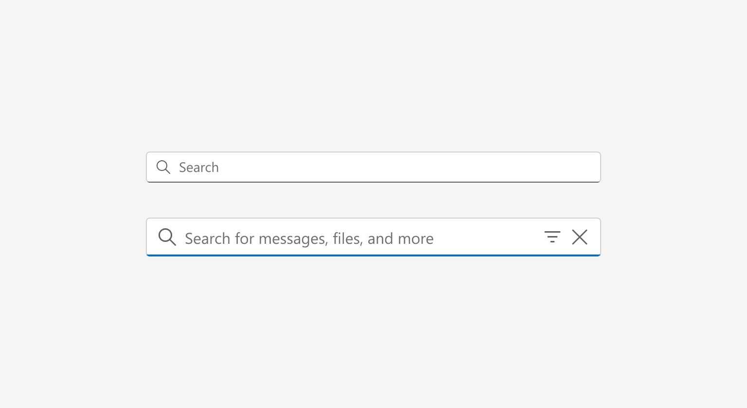
Searchbox lets people access information with ease, providing flexibility and the ability to clear and filter the search.
Resources
Behavior
Focus animation
The animation between the rest and focus state is the same as the input field animation. It appears once the searchbox receives focus.

Layout
A consistent layout in the search form creates a learned pattern and brings ease to our users. The Close button is only present when there’s content in the searchbox. The filter icon and filter dropdown are optional based on the the needs and technical capabilities of your app.

Accessibility
Responsiveness
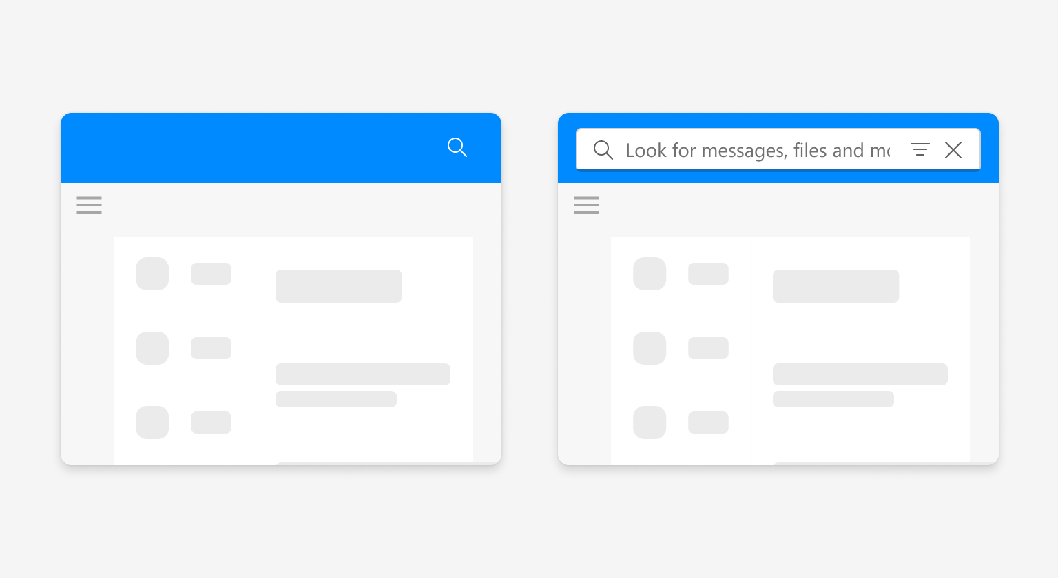
The searchbox is fully responsive to the container it lives in. While zoom levels and page sizes affect the space the searchbox holds, it keeps the same functionality. When designing you page at the 400% zoom level, consider where your searchbox will live and how often it’s used. At smaller viewport sizes, the searchbox can be redrawn as the Magnifying glass icon which, when clicked, activates the full width searchbox for better usability.

Content
Results ordering
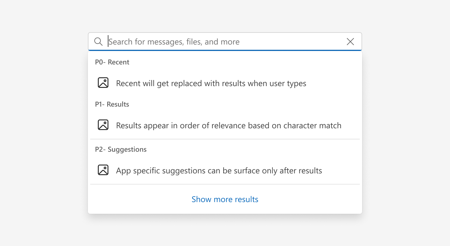
Searchbox lets users directly access habitual topics quickly while also serving as a helpful path to unfamiliar topics. They expect results to be precise, auto-complete, intelligent, and predictive. This is why setting ordering guidance will help build trust in the results.
Some search commands may take time to retrieve results which is why the ordering strategy is flexible for some of those cases.
Recent topics are shown as soon as the searchbox receives focus. It’s then replaced with suggested results as a search input is entered and the search query gathers results. Many apps surface related topics and suggestions after the results.
Make sure to always show the most relevant options closest to what the user is looking to find first.
