Shapes
Shapes help make UI personable, easier to process, and recognizable at a glance. Selecting the correct shape for components builds consistent visual vocabulary and narrative.
Form, corner radius, and stroke are the properties used to define shapes.
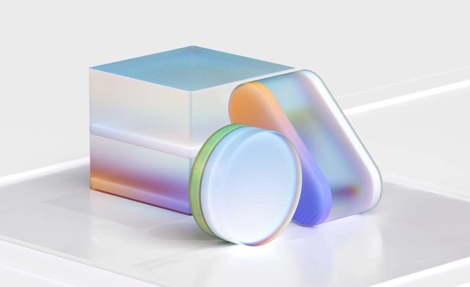
Forms
Fluent components use four simple forms: rectangle, circle, pill, and beak.
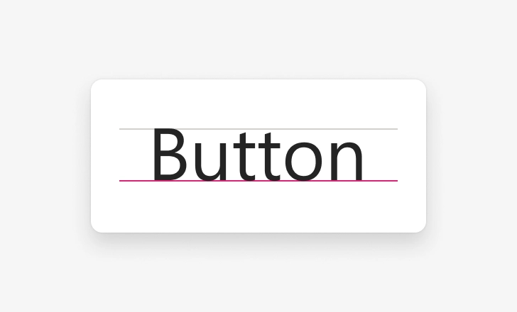
Rectangle
The rectangle is the basic shape for most common components and containers, like buttons, textareas, menus, cards, and images.

Circle
Circles are used for avatars and other components displaying or representing people.
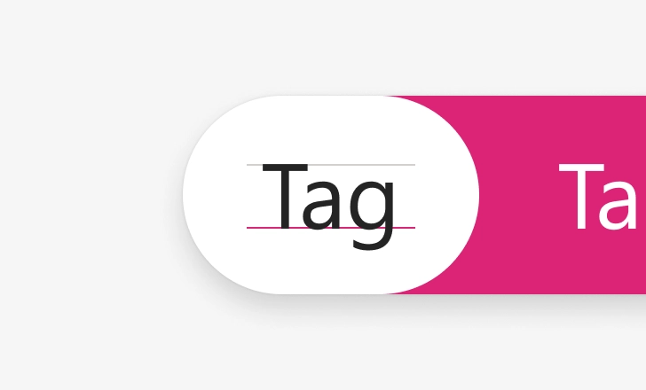
Pill
A pill can represent paths like a slider’s track or a toggle’s channel. Pills can also show tags, keywords, or a selection in a list.
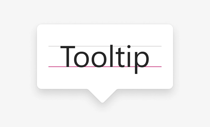
Beak
A beak offers a reference point for floating surfaces associated with a single object, like callouts or popovers.
Forms are then distinguished from their surroundings either by fills or borders.
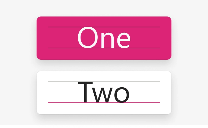
Fill
Fill styles can define and emphasize a shape.
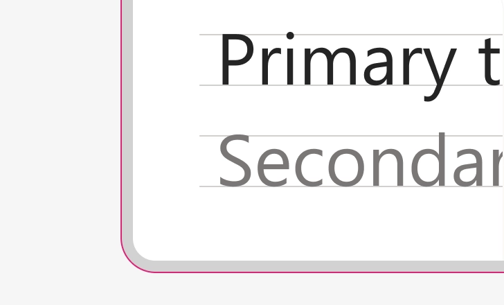
Border
Borders identify the bounding container on unfilled shapes, like cards.
Corner radius
In most cases, corner radiuses on rectangle shapes are 4 pixels by default. For shapes smaller than 32 pixels, the corner angle is reduced to 2 pixels. For large and extra-large components, 8 pixel and 12 pixel angles are used. Follow iOS and Android guidelines for mobile contexts.

Corner radius tokens
Use these radius tokens to change the corner radius on elements.
| Token | Usage | Value |
|---|---|---|
| None | Navigation bars, tab bars | 0 pixels |
| Small | Small badges | 2 pixels |
| Medium | Buttons, dropdown | 4 pixels |
| Large | Large buttons | 8 pixels |
| X-Large | Button sheets, popovers | 12 pixels |
| Circle | Personas | 50% |
Fluent uses rounded corner styles in three areas of UI components: rectangular elements, flyout elements, and pill-shaped or round elements.
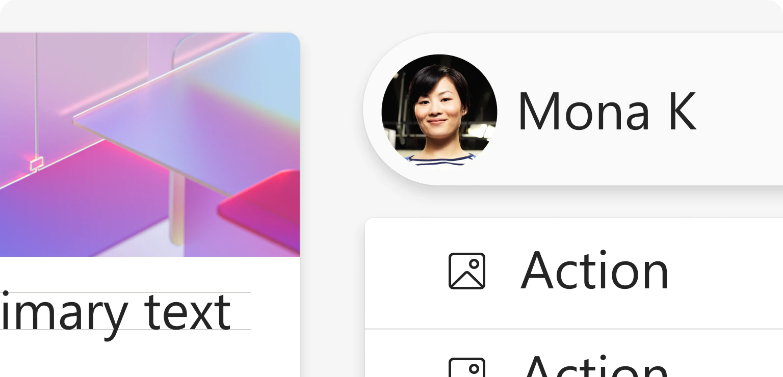
When to avoid rounded corners
There are instances by default when the corner of a component should not be rounded, like when it would result in awkward gaps.
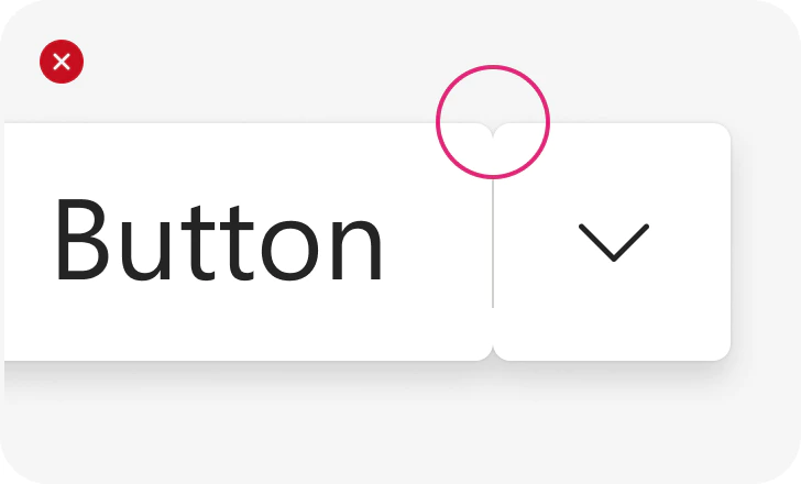
Avoid unnecessary spaces
Be sure to exclude space between multiple UI elements in a single container. For example, both parts of a split button.
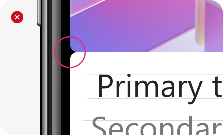
Skip rounded corners at the screen’s edge
Rounded corners are not necessary for components that reach the edge of the screen.
Stroke
Apply stroke properties to create lines, arrows, borders, and vector networks. You can control the weight of the stroke, color, distribution, and endpoint properties.
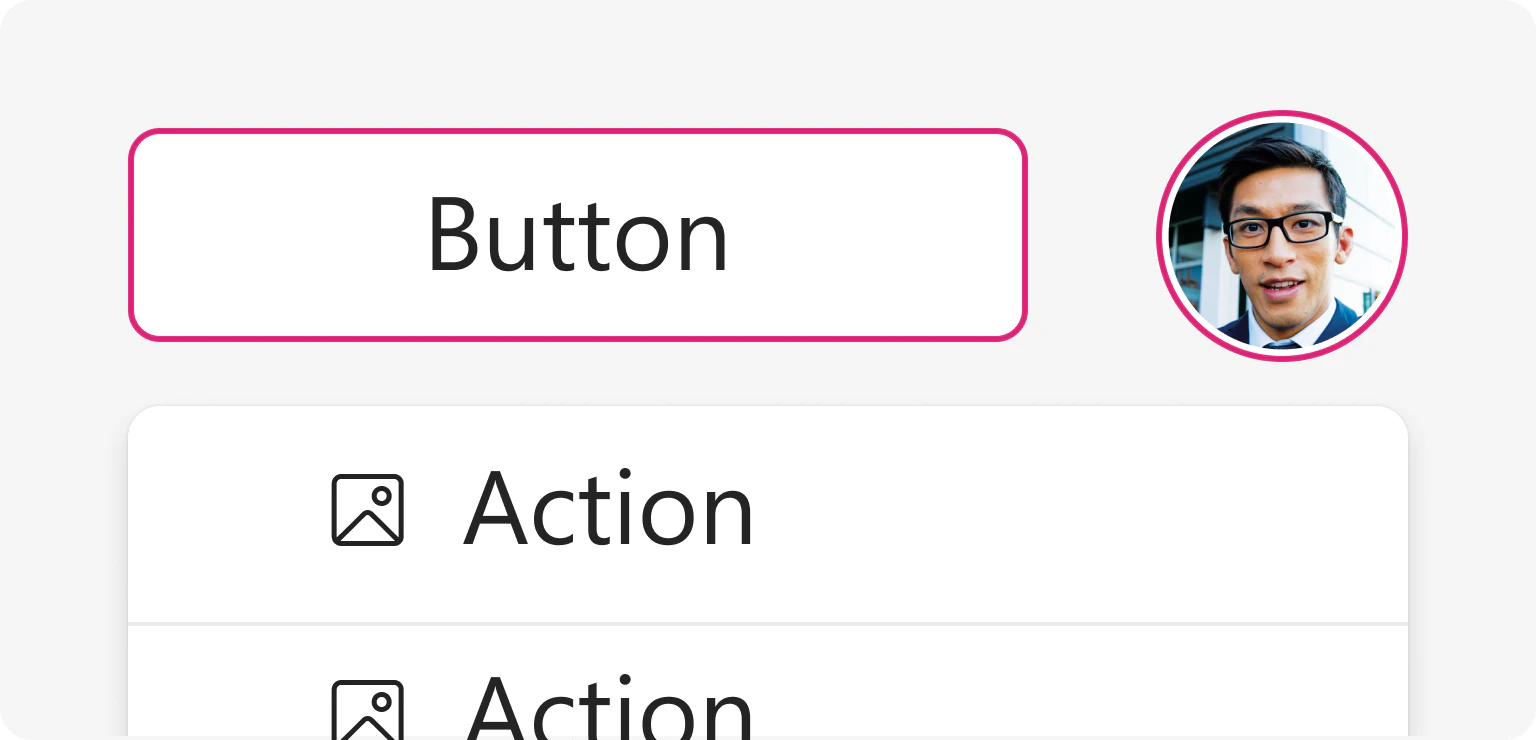
Stroke Thickness
Change line thickness with stroke tokens.
| Token | Web | Mobile |
|---|---|---|
| Thin | 1 pixel | 1 pixel |
| Thick | 2 pixels | 2 pixels |
| Thicker | 3 pixels | 4 pixels |
| Thickest | 4 pixels | 6 pixels |
To achieve correct visual weight, consider the size of the element when determining the stroke thickness. For example, on an avatar activity ring, strokes scale from a 2 pixel ring for smaller avatars to a 4 pixel ring for larger avatars. The visual weight feels consistent as the element scales up or down.

Stroke dash array
Strokes can collect double values that indicate the pattern of dashes and gaps used to outline shapes or use as brushes. Scale everything proportionally based on stroke thickness (n) by following the simple equation for each dash array.
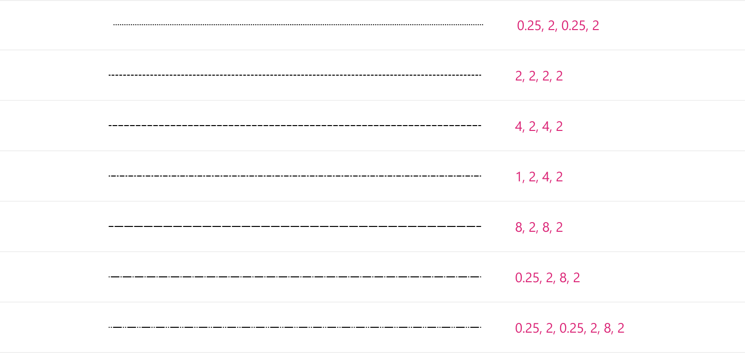
Stroke caps
Use the listed radius tokens to round the caps of strokes for a consistent feel.
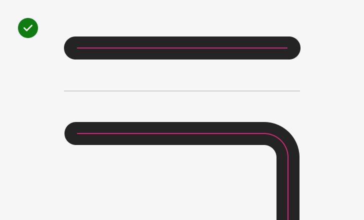
Use rounded corners
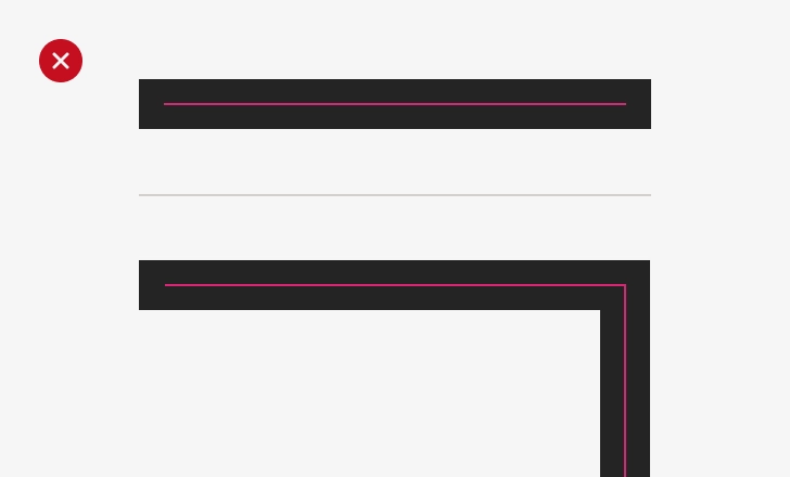
Avoid square stroke caps