Typography
Clear typographical hierarchy organizes and structures content, making it easy for people to find their way through an experience.

Fluent font stacks
Segoe - unmistakably Microsoft
Friendly and legible, Segoe is Microsoft’s signature typeface. It emphasizes readability and personality at different sizes. Variants of Segoe are used across Windows OS, Win UI native apps, and web apps.

Native type on every platform
While Segoe UI is Fluent’s primary typeface, the system defaults to native system fonts to ensure a familiar and accessible experience across platforms.

Type ramp
The Fluent type ramp for web builds from a long history of design at Microsoft. The type options provide clear style direction and semantic roles for creating scannable hierarchies and a sense of balance. This ramp uses Segoe UI as the default typeface.
| Name | Weight | Size / Line-height |
|---|---|---|
| Caption 2 | Regular | 10px / 14px |
| Caption 2 Strong | Semibold | 10px / 14px |
| Caption 1 | Regular | 12px / 16px |
| Caption 1 Strong | Semibold | 12px / 16px |
| Caption 1 Stronger | Bold | 12px / 16px |
| Body 1 | Regular | 14px / 20px |
| Body 1 Strong | Semibold | 14px / 20px |
| Body 1 Stronger | Bold | 14px / 20px |
| Subtitle 2 | Semibold | 16px / 22px |
| Subtitle 2 Stronger | Bold | 16px / 22px |
| Subtitle 1 | Semibold | 20px / 26px |
| Title 3 | Semibold | 24px / 32px |
| Title 2 | Semibold | 28px / 36px |
| Title 1 | Semibold | 32px / 40px |
| Large Title | Semibold | 40px / 52px |
| Display | Semibold | 68px / 92px |
The Fluent type ramp for Windows uses Segoe UI Variable, a variant of the signature typeface. The type options provide clear style direction and semantic roles for creating scannable hierarchies and a sense of balance.
| Name | Weight | Size / Line-height |
|---|---|---|
| Caption | Regular small | 12px / 16px |
| Body | Regular | 14px / 20px |
| Body Strong | Semibold text | 14px / 20px |
| Body large | Regular | 18px / 24px |
| Subtitle | Semibold display | 20px / 28px |
| Title | Semibold display | 28px / 36px |
| Large Title | Semibold display | 40px / 52px |
| Display | Semibold display | 68px / 92px |
The Fluent type ramp for MacOS builds on Apple’s font family to create a clear and legible hierarchy across Mac devices. This ramp uses San Francisco Pro.
| Name | Weight | Size / Line-height |
|---|---|---|
| Caption 1 | Regular | 10pt / 13pt |
| Caption 1 Strong | Semibold | 10pt / 13pt |
| Body 1 | Regular | 13pt / 16pt |
| Body 1 Strong | Semibold | 13pt / 16pt |
| Subtitle 2 | Regular | 11pt / 14pt |
| Subtitle 1 | Bold | 13pt / 16pt |
| Title 3 | Regular | 15pt / 20pt |
| Title 3 Strong | Semibold | 15pt / 20pt |
| Title 2 | Regular | 17pt / 22pt |
| Title 2 Strong | Bold | 17pt / 22pt |
| Title 1 | Regular | 22pt / 26pt |
| Title 1 Strong | Bold | 22pt / 26pt |
| Large Title | Regular | 26pt / 32pt |
| Display | Bold | 30pt / 40pt |
The Fluent type ramp for iOS builds on Apple’s font family to create a clear and legible hierarchy across mobile devices. This ramp uses San Francisco Pro, the native iOS font.
| Name | Weight | Size / Line-height |
|---|---|---|
| Caption 2 | Regular | 12pt / 16pt |
| Caption 1 | Regular | 13pt / 18pt |
| Caption 1 Strong | Semibold | 13pt / 18pt |
| Body 2 | Regular | 15pt / 20pt |
| Body 2 Strong | Semibold | 15pt / 20pt |
| Body 1 | Regular | 17pt / 22pt |
| Body 1 Strong | Semibold | 17pt / 22pt |
| Title 3 | Semibold | 20pt / 25pt |
| Title 2 | Semibold | 22pt / 28pt |
| Title 1 | Bold | 28pt / 34pt |
| Large Title | Bold | 34pt / 41pt |
| Display | Bold | 60pt / 70pt |
The Fluent type ramp for Android builds on Android’s font family to create a clear and legible hierarchy across mobile devices. This ramp uses Roboto, the native Android font.
| Name | Weight | Size / Line-height |
|---|---|---|
| Caption 2 | Regular | 12sp / 16sp |
| Caption 1 | Regular | 13sp / 18sp |
| Caption 1 Strong | Medium | 13sp / 18sp |
| Body 2 | Regular | 14sp / 20sp |
| Body 2 Strong | Medium | 14sp / 20sp |
| Body 1 | Regular | 16sp / 24sp |
| Body 1 Strong | Semibold | 16sp / 24sp |
| Title 3 | Medium | 18sp / 24sp |
| Title 2 | Medium | 20sp / 24sp |
| Title 1 | Bold | 24sp / 32sp |
| Large Title | Regular | 34sp / 44sp |
| Display | Regular | 60sp / 72sp |
Styling text
Sometimes it might be necessary to use different text formatting to indicate hierarchy or prominence. Follow these tips to keep readability top of mind when styling and formatting text.
Casing
Use sentence case when writing, it fits most contexts. Don’t use all caps to get a user’s attention because it’s difficult to read. See the content design guidance for more information.
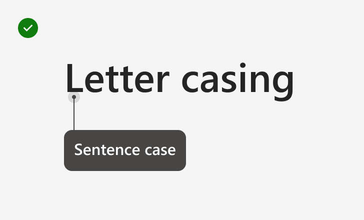
Write in sentence case
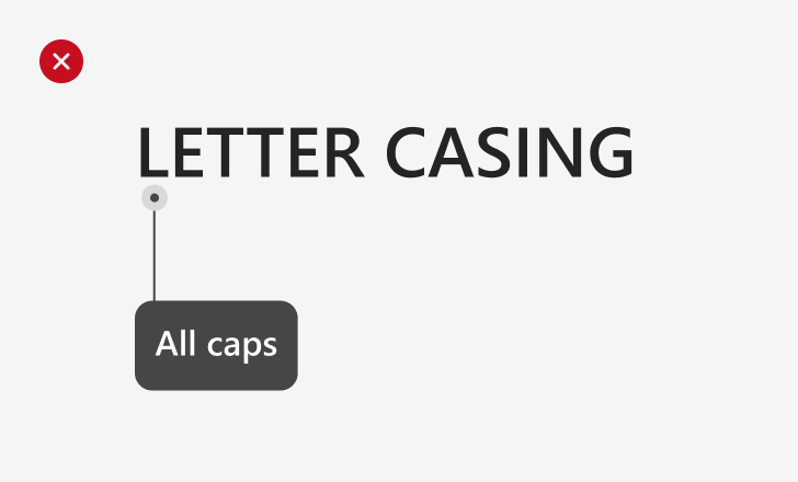
Avoid using all caps
Alignment
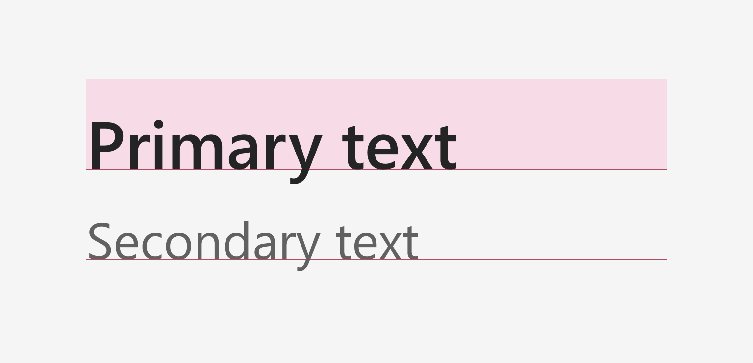
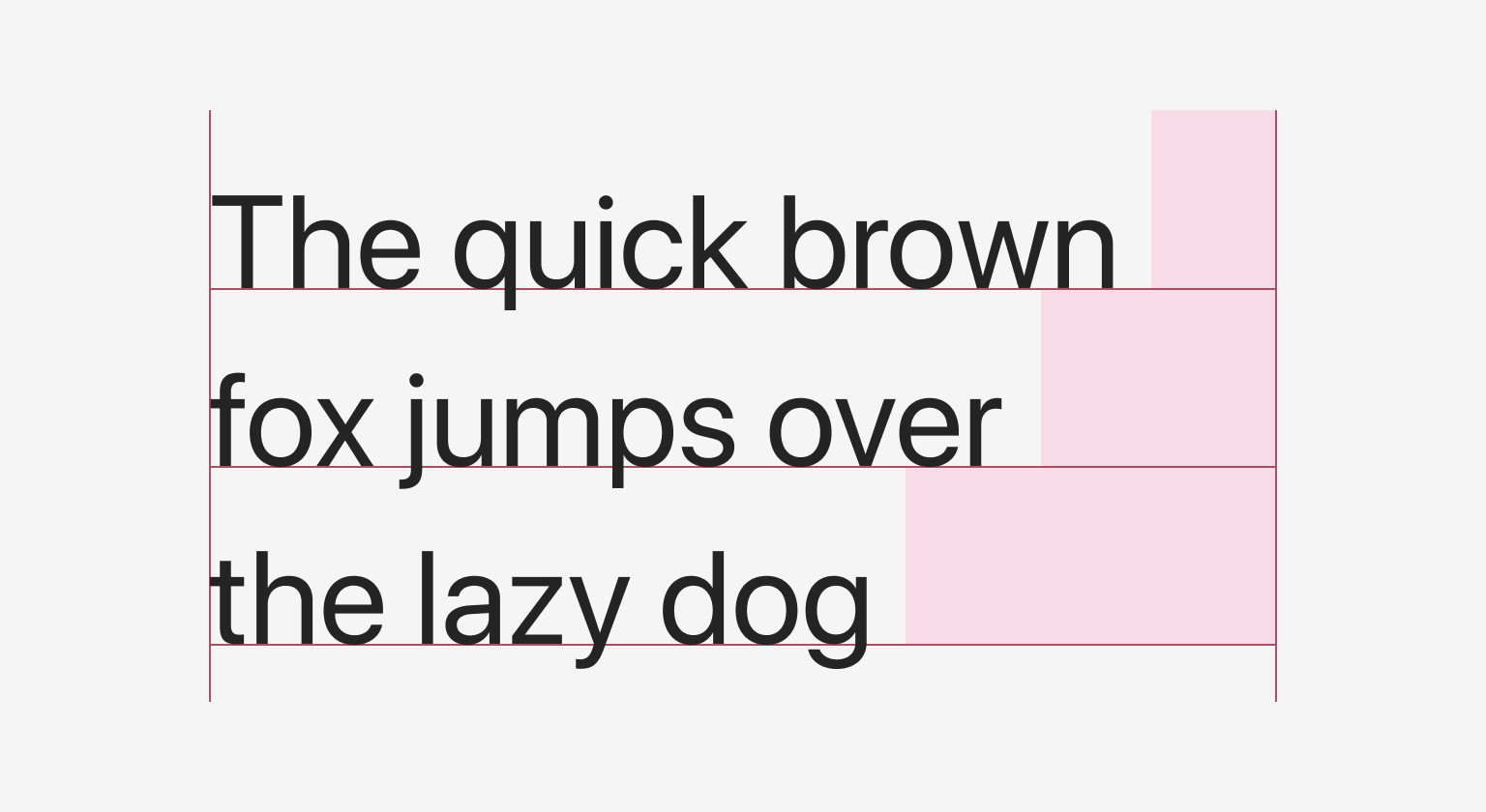
Fluent uses baseline alignment to distribute vertical space. This creates a consistent visual rhythm within a layout.
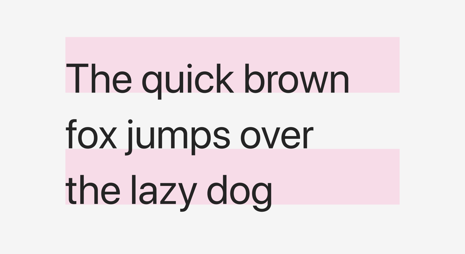
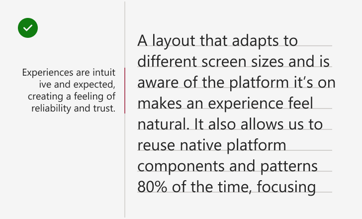
When aligning text horizontally, generally stick to left-alignment for left-to-right (LTR) languages, like English.
Use right-alignment for right-to-left (RTL) languages, like Arabic or Hebrew, or to distinguish a short text element in English, like a side note. Don’t right-align long blocks of text in LTR languages.
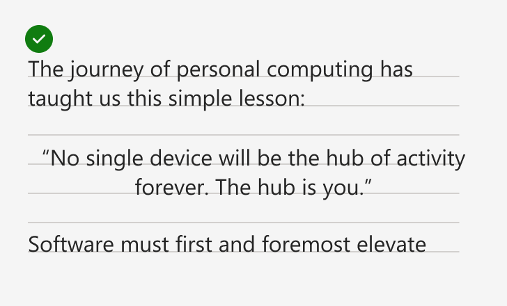
Use the same discretion when centering text. It should call attention to a small piece of copy, or support another element on the page.
Color
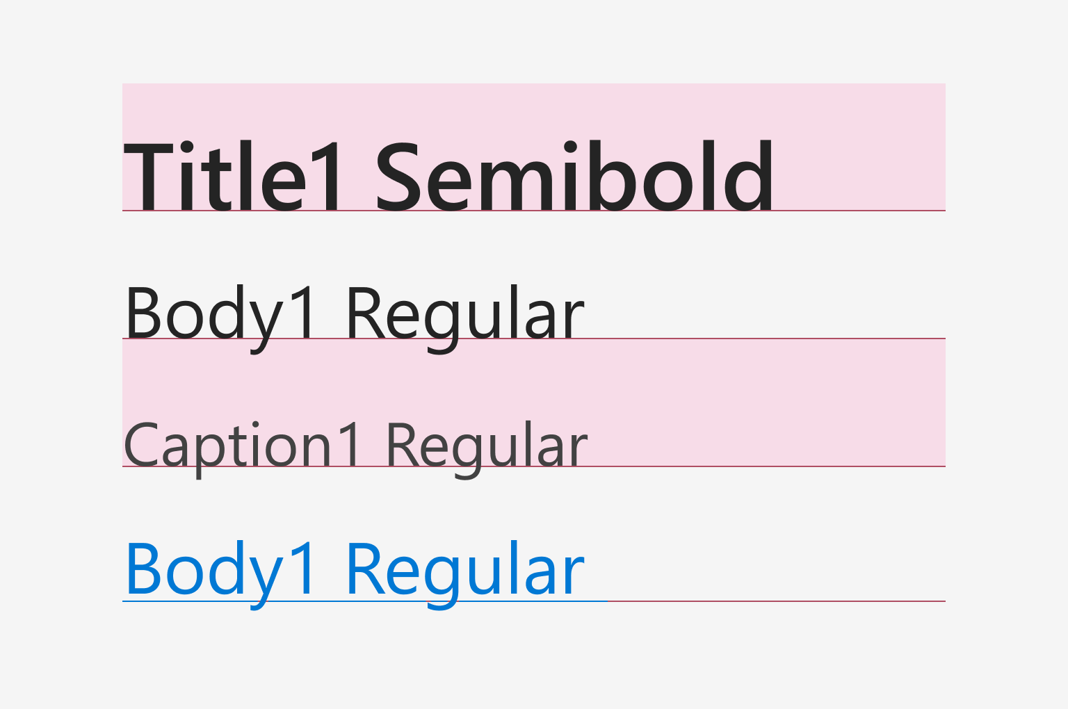
Applying color can emphasize or de-emphasize text. Using a primary color on text will give it more visual prominence than the standard text color. In contrast, using a lighter neutral than standard text will subdue the text and place it lower in a visual hierarchy.
Be sure to follow the color guidelines when applying color to text.
Standard text must have a contrast ratio of at least 4.5:1 against its background. Large text (above 18.5 pixels bold, or 24 pixels regular) must have a contrast ratio of at least 3:1. Use these resources to make sure your designs pass color contrast and other accessibility considerations.
