iOS overview
Components are the building blocks of a design system, built to solve specific UI problems. Fluent iOS is a customized subset of components that fits seamlessly with native Apple components, letting you build uniquely Microsoft experiences that are native to the platform.
Need to get set up first? Check out the start designing and start developing guides.
Note: Fluent iOS is upgrading to include the Fluent 2 design language and token system, as well as modularized code, so you can grab only what you need. These components are still in the works, so be careful if you pull them in production; changes to them might require fixes to your app down the line. We’ll add more components and APIs as they become available.
Resources
Components

Activity indicator
An activity indicator lets someone know there’s a background task in progress and assures them the system is still working.
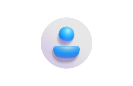
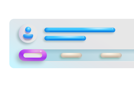
Avatar
An avatar shows an image or text to represent a person or group as well as gives additional information like their status and activity.
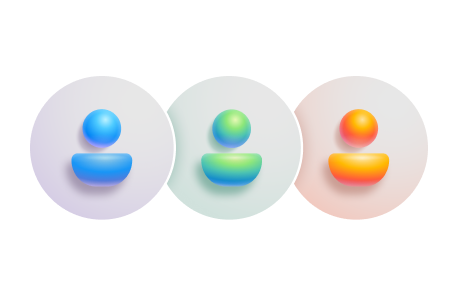
Avatar group
An avatar group shows multiple avatars.
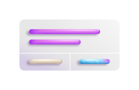
Button
A button triggers a single action or event.
Card nudge
A card nudge is a short message that helps people discover what they can do in an app.
Heads-up display
The heads-up display, or HUD, is a progress indicator that appears on a backplate and can give additional text information about the background task that’s occurring.
Navigation bar
The navigation bar provides information and actions relating to the current screen.
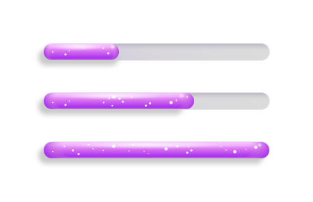
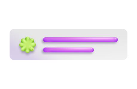
Progress bar
A progress bar lets someone know there’s a background task in progress.

Segmented control
A segmented control lets someone select one option from a set of two or more segments in a single, horizontal container.

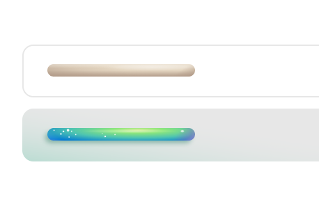
Shimmer
A shimmer lets people know that a section of information is loading without blocking other UI elements from rendering.
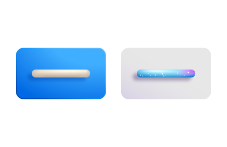
Text field
A text field lets people enter short, free-form text data.

Tooltip
A tooltip provides supplemental, contextual information without shifting people’s focus away from the primary interface.